This post concerns the visualization of property values. I am working on this for an upcoming project on the African American experience in Asbury Park, New Jersey, and particularly the 1970 riot. Part of this research focuses on the socioeconomic experiences (e.g., access to property ownership, property values) of various groups ithroughout the 20th century. Property ownership remains part of the “American Dream” and lured African Americans to many northern locations, places promising a more equitable society. A promised often denied.
One goal for this project explores geovisualization. Geovisualization, short for geographic visualization, is the visual representation of geospatial analyses. This increasingly involves the creation of interactive displays to share location-specific data. This post is not a nuts-and-bults how to, but it does outline the general steps and process for producing some interesting images of property values.
 The data for such an analysis (e.g., shapefiles, tax record tables) are available for download at the New Jersey Geographic Information Network (NJGIN)Information Warehouse – https://njgin.state.nj.us/NJ_NJGINExplorer/IW.jsp. The parcels are available as a shapefile and the property values as a spreadsheet. These data must be joined in ArcMap.
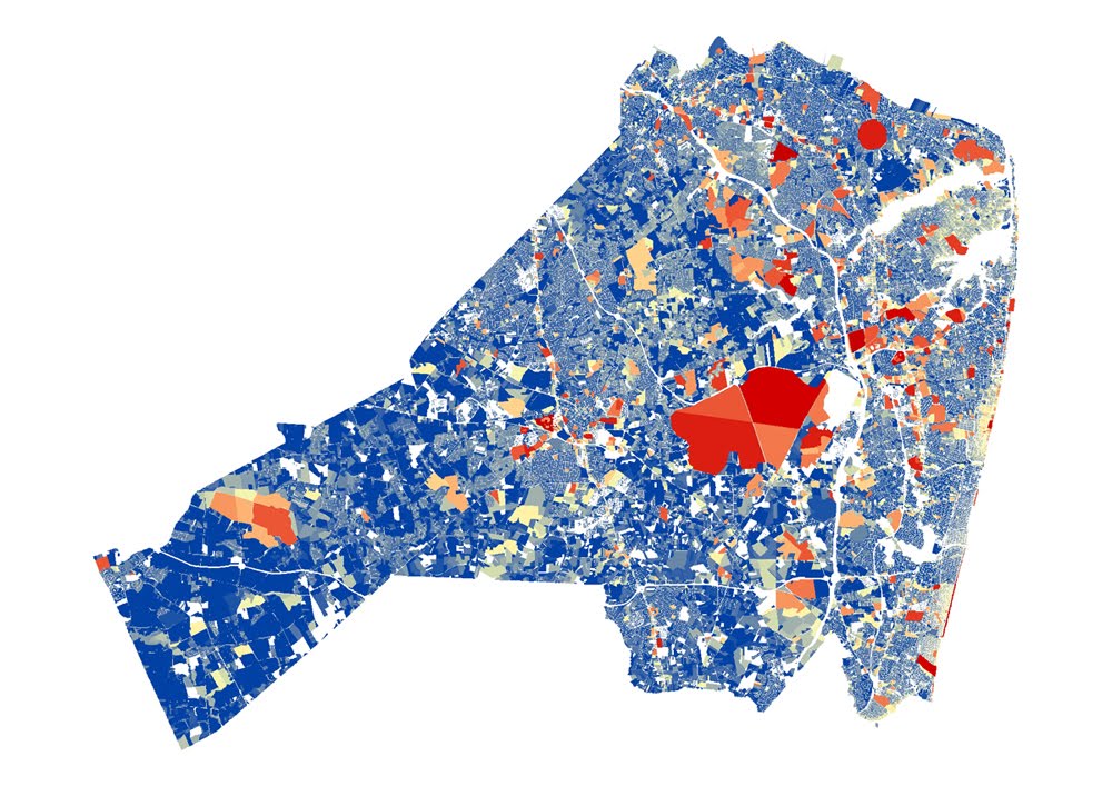
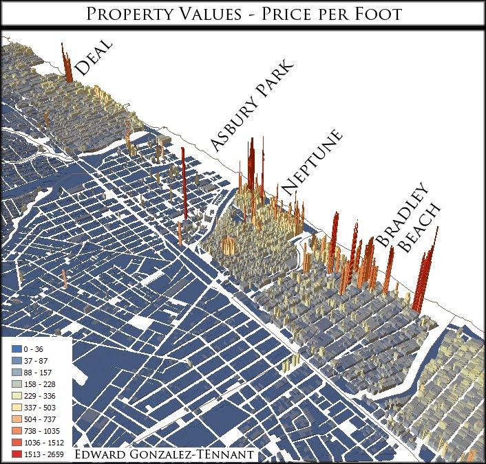
A second shapefile of municipal units from the NJGIN was used to export a selection of the full parcel dataset for Monmouth County. The exported shapefile, visualized below, was centered on Asbury Park, NJ. Each property was extruded to a height representing the price per foot. The graphic clearly shows the only break in higher property values along the northern Jersey Shore occurs in Asbury Park.
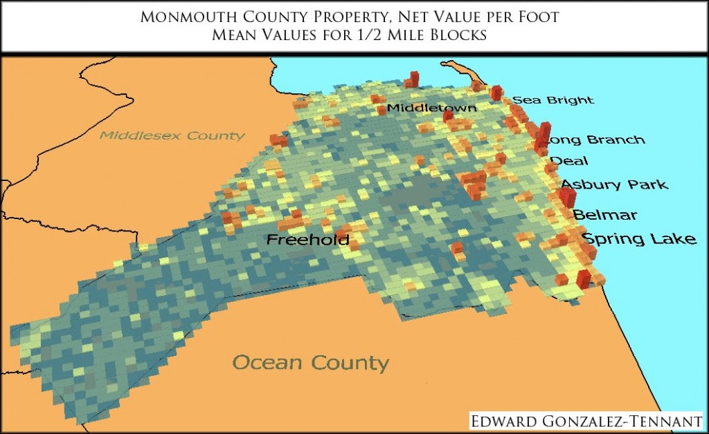
 The above image extrudes each property parcel to a height value based on the property’s price per foot. These totals can be summarized and represented for 1/4 mile sections for the entire county as well.

